A quick exercise as part of the summer intensive in interaction design coursework at the School of Visual Arts.
We’ve all been there: too hungry to decide what to eat, increasingly indecisive as we get hangrier. Hunger short-circuits our decision-making systems and exacerbates irritability and tiredness, and it’s only worse in a group. “What do you want to eat?” “I don’t know, what do you want?” “How about tacos?” “I had tacos last night.” Suddenly we find ourselves trapped in an endless loop until we make a desperate escape with some lowest-common denominator none of us really wanted. There must be a better way.
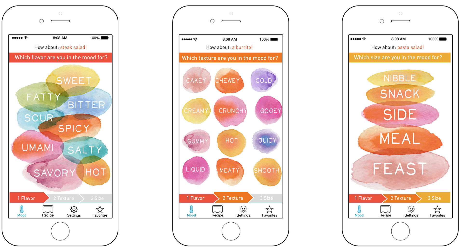
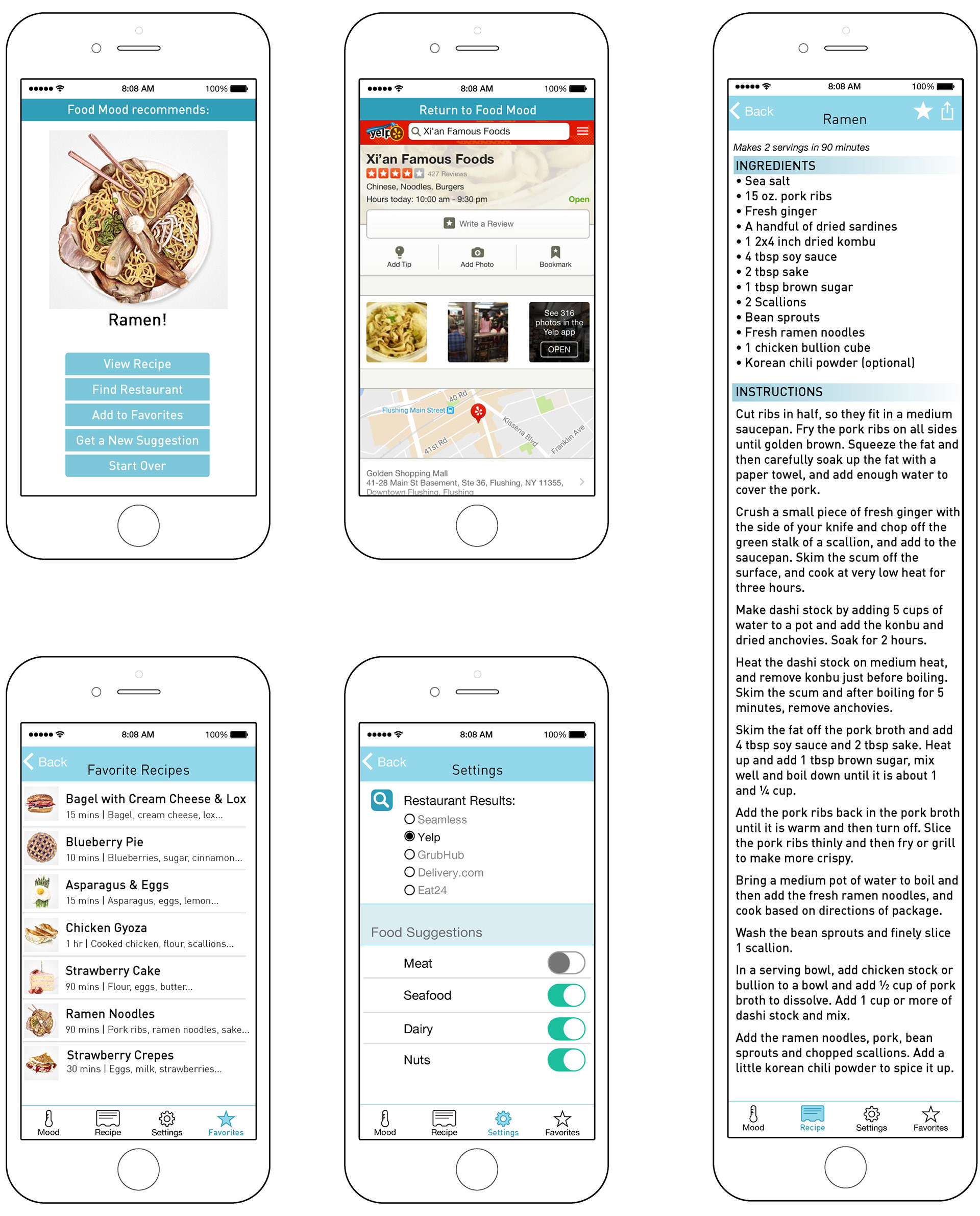
My aim was to create an engaging, beautiful interface that would make choosing what to eat fun and easy for people who are hungry and likely impatient, maybe even tending towards hangry. I also had in my mind people struggling with appetite problems due to illness or medication. Instead of scrolling through endless food choices, they can choose a flavor, a texture, and a size (though any or even all can be skipped) and Food Mood will provide a suggestion. If it's not right, you can start over. If it sounds good, you can either get a nearby restaurant suggestion or a recipe.
I designed the Food Mood app to provide a fun escape from that negative loop of hanger and indecisiveness. Food Mood asks only three simple, broad questions about what you’re in the mood for (texture, taste, and size) via a colorful, engaging interface to narrow down its options to a single suggestion, and then provides links to resources (recipes, links to restaurants, and ordering options). It shifts the perceived burden of work (shifting through many options) to itself and focuses on how the user feels to make the interaction fun.

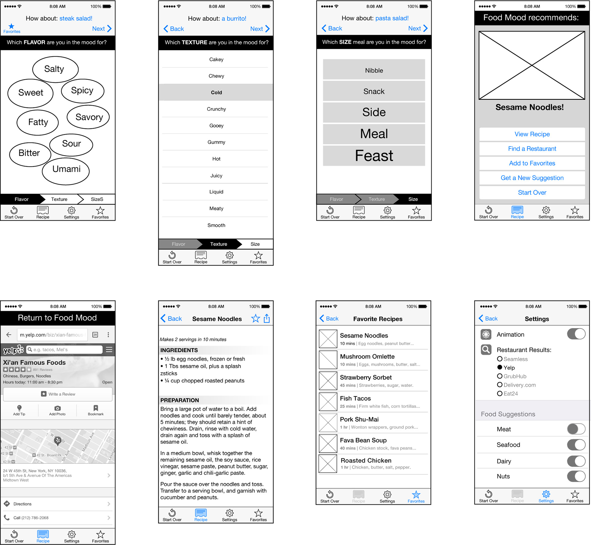
Though simplistic, the version below elaborated on the navigation system of the initial flow (see below) to help users to skip ahead or jump back. It also included immediate suggestions at the top to help save time for the less picky users and a new section at the end, offering options for people to continue engaging with the app once they’ve decided what to eat by choosing a recipe or connecting to a restaurant. Another key change was the elimination of the animation before delivery of the result — I was very fond of that idea, but users did NOT like the idea of waiting around even for a few seconds for the result. It was extremely valuable to learn this before putting time and effort into crafting even a mockup of the animation.

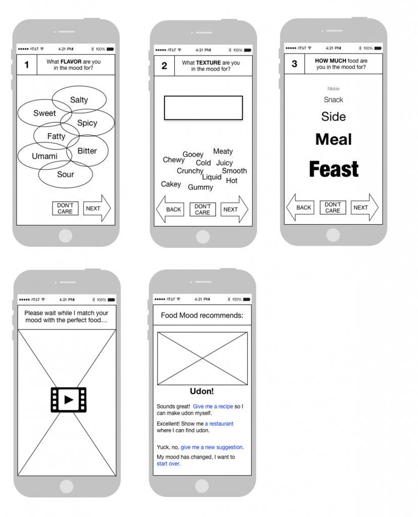
In addition to a basic user flow, I created lo-fi wireframes in order to flesh out the preliminary user flow, and begin initial user testing so I could immediately verify that the flow and basic concept made sense to users. This early version is pretty rough, but got the initial flow down so I could get valuable feedback right away.

I learned many things on this project, but probably the most memorable was how powerful it is to have even a small amount of user feed back at even the very earliest stages of a project. I’d always put user feedback(other than marketing research) into a slot further along in development, but it was incredible useful to have immediate and frequent feedback throughout this project. I was surprised during the user testing to discover that users were disoriented even during the very short user flow without a clear progress indication, which I added in later iterations. I was also interested to learn that users frequently wanted to abandon the process in the middle because they changed their mind and wanted to start over, so I incorporated that insight into the UI.